Categories
Color Pen and Ink Sold

Crystal Method

Crystal Method. Gelly Roll Glaze, Metallic, and Moonlight pens, Derwent Inktense pencils, and Holbein Gouache paints on Strathmore 300 Series Bristol Paper, mounted on a 12″ x 12″ x 1″ panel treated with hammered metal paint. 12″ x 12″ framed. $550 SOLD

This piece was created for the UNDISCLOSED exhibit at the Toledo School for the Arts. The exhibit is a fundraiser for the school in which patrons purchase tickets, then randomly draw a number from a fishbowl at the event that determines the order in which they can choose a piece. The artists sign their works on the back of the piece; hence the “undisclosed” part, which puts all of the artists on a level playing field in the selection process.

I did this one in a style that’s different from my signature black-and-white, gravity-agnostic, news-driven pieces for the purpose of obfuscating who did it, and I think I was successful. The blend of gouache at the bottom was a last-minute addition at the suggestion of my daughter, and I’m pleased with how that came out; it creates depth where there wasn’t before. The top was surprisingly demanding to create with precision (freehand is hard!), and the entire piece took a good eighteen hours or so. The foremost row of crystals are outlined with Gelly Roll’s Metallic pens and filled with their Glaze pens, which gives them a three-dimensional aspect and makes them glisten as the viewer shifts their perspective. Those in the middle are filled with the Moonlight pens, and the rear-most were done with the Derwent Inktense pencils, the marks of which were then ‘washed’ with a wet brush. The purpose of using the different types of pens and pencils was also to create a sense of depth in the crystal array, but I can’t decide how effective that was – What do you think?

Categories
Art Color For Sale Pen and Ink

Leaves II

Leaves I. Zig Fudebiyori Metallic and Uni-Ball Signo pens on Fabriano Black Black drawing paper. 8" x 8"
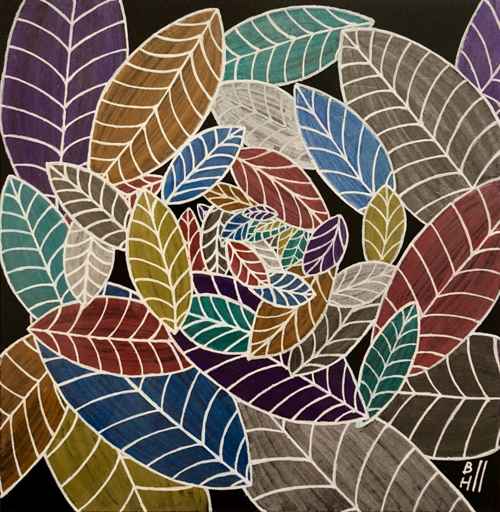
Leaves II. Zig Fudebiyori Metallic and Uni-Ball Signo pens on Fabriano Black Black drawing paper. 8″ x 8″ unframed. $240

This piece is the second in a series on the theme of leaves, which I mostly produced to test the Fudebiyori pens I acquired recently. This one was a lot of work to create, especially as I had to go over most of the white lines twice (and then do the typical back-and-forth cleanup), however I think the end results are solid. I really like the Black Black paper – It’s amazingly uniform in color, especially compared to the Strathmore, which is one of the reasons I left bits of it showing through. I also minimized over-use of the colored pens on this one, to try to preserve more of the sheen of the metallic additives in the ink; that was largely successful. I still haven’t gotten the time to set up high-quality photos of my work with truly accurate colors the way I’d like, but I’m hoping to get that issue resolved soon.

Categories
Art Color For Sale Pen and Ink

Leaves I

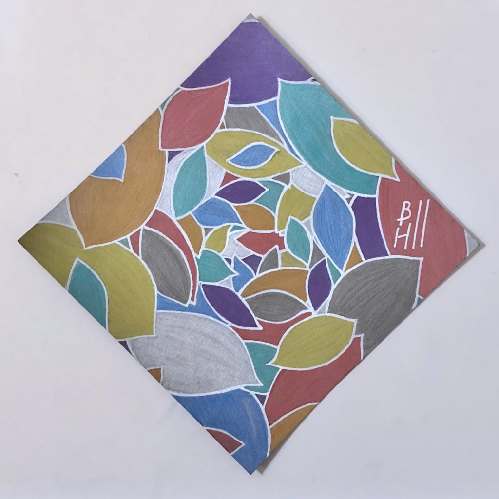
Leaves I. Zig Fudebiyori Metallic and Uniball Signo Broad pens on Strathmore 400 Series Black Artist Tile. 6" x 6"
Leaves I. Zig Fudebiyori Metallic and Uniball Signo Broad pens on Strathmore 400 Series Black Artist Tile. 6″ x 6″ unframed. $180

I finally got a chance to do more art! Since I took a position last fall as a consultant for Improving, my evenings have been almost entirely occupied with user’s group meetings and technical events, which has severely constrained my drawing time. My apologies that the blog has gotten stale as a result.

This was a piece I did to test my new Fudebiyori pens that I picked up at the Art Supply Depō last weekend. The title is Leaves I, because I’m planning on doing a conceptually similar piece on a bigger, blacker piece of paper next. I learned a few lessons that will help with the next one. For example, using multiple coats of the Fudebiyori makes the color more intense, but takes the shine out of the ink (I’m guessing that the mica particles, which is what’s usually in these things that’s responsible for the metal-like sheen, sink to the bottom layer, but I don’t have a microscope for a closer look.) And the Uniball ink will melt some of the Fudebiyori colors, which makes it surprisingly hard to maintain the integrity of the white border lines. Overall, though, I think this one is technically decent and has a good balance of colors. I also suspect it will look really snappy once it’s framed, which I intend to do.